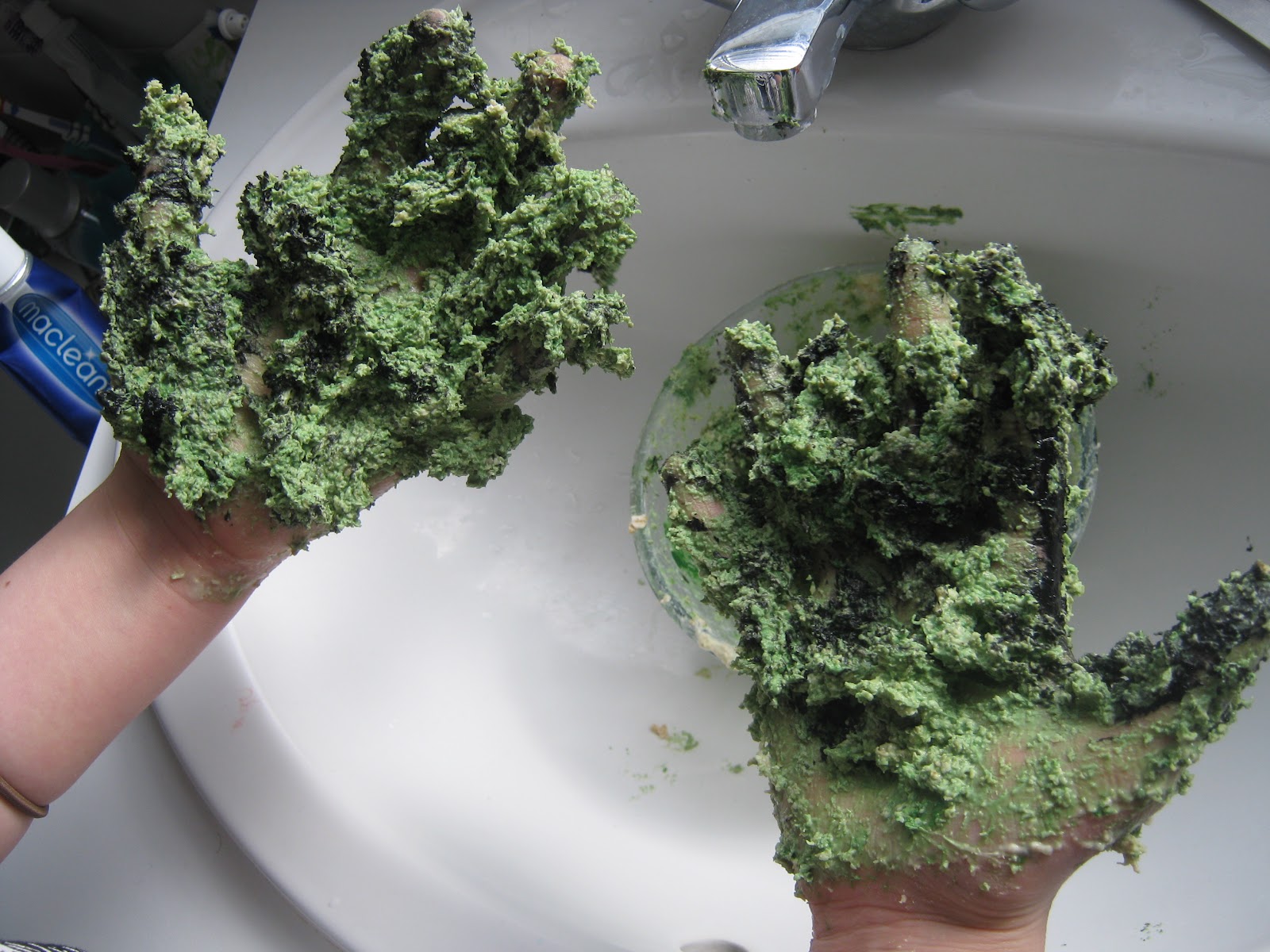
I wanted to make my own kind of prosthetics like McRae & Hess do in their series. I researched various ways to do this and found that you can use materials such as paper machae but decided on using porridge. I mixed it the oats with water, PVA glue and black and green paint. This made a thick substance that would hopefully look as if it was growing on the model. This is another repulsive texture that i thought would be appropriate.
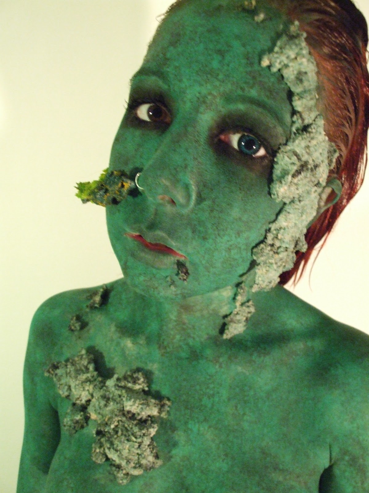
To make the model look mouldy and mutant like I painted her green using face paint from the waistline up. I have chosen green as my main colour as nuclear waste classically glows green and i was also looking at the element of mould and decomposition. So that the model did not look clean and too bright green I dabbed her with black face paint using an artist sponge. The texture of the sponge created the blotched pattern and I was very pleased with it.
I fixed the issue of the hair by using a lot of gel to slick it back. By doing this we managed to make the hair colour seem a lot darker but also gave the model a slicked wet look which is for more suitable for this project. I also had the model blacken around her eyes as they looked for to plain when they were just green and it also draws attention to the models eyes. You can also see the first accessory in this image that had been attached from the nose ring up to the earring at the top of her ear.
I knew that wanted to do a portrait shot and some body shots but was unsure of exactly how it would look and what positions would be best so I did a test shoot first in digital.
idea
I decided not to reshoot my test shoot as I no longer felt very inspired by the ide. It was more about the way nuclear waste glowed and looked but with no actual statement being made. I wanted to look further into how nuclear waste had affected people which I had also asked harry to look at above. The nuclear disaster in Chernobyl was a good source of research as it effected so many and the effects were horrific. It was also documented by various photographers which i am going to look at below.
Chernobyl
One of the worlds worst nuclear disasters occurred in the Ukraine on the 26th April 1986. This was a result of a failed reactor test in the nuclear power plant in Belarus, Chernobyl. The unusable radioactive elements where spread by the carrying of dust particles but was also deposited in the earth by rainfall and entered food through plants and animals. This had a huge impact on the health of those in Belarus.
- The disaster lead to the displacing of 200,000 people
- Instantly 53 residents and emergency workers died
-'Chernobyl Children's Project International' have said the 3-4 million children were affected by the disaster
- It has been predicted that 50,000 children will develop thyroid cancer within the region using their lifetime
-Leukaemia has increased by 50% in adults and children
-5 years after the disaster it was reported that there were 3 times the normal rate of deformities and developmental abnormalities in newborn children as well as an increased number of miscarriages, premature births and still births.
- Hereditary defect in Belarusian newborns also increased after the disaster
Vintage Images

I had the idea of maybe finding old portraits of babies and children and collaging the images in some way to show small forms of deformity. When discussing this at my tutorial I realised how sensitive the topic is and could be seen and very offensive in if i developed this idea as it was not my intention to make the children look comical in any way. Also there was the issue that the images that I had been looking at were not specific to any one time so had no direct relevance apart from the fact that i was looking at children. I discarded this idea and no longer felt that I wanted to carry on with this topic as it could be highly controversial.
New idea
I have decided to start from scratch and come up with a completely new idea. I am going to look at the claim expenses scandal from 2011 and the 'waste' of tax payers money.
-After a team of reporters had worked in secrecy examining a leaked computer disk containing more than 1.5 million individual receipts, the expose began with the publication of the Cabinet's expenses on May 8.
-The news that Cabinet members had flipped houses, avoided capital gains tax and bought chocolate bars with taxpayers' money was quickly followed up with the shadow cabinet's expenses.
List of claims I found interesting:
Quentin Davies:
-£10,000 of taxpayers money for repairs to window frame for second home (an 18th century mansion)
James Arbuthnot:
-Swimming pool maintenance
Bill Cash:
-claimed 15,000 to give to his daughter for a new flat
Dawn Butler:
-Jacuzzi style bath fitted in second home
Phil Woolas:
-Ladies clothing, comics and nappies
Jacqui Smith:
- Bath plaug costing 88p/ 2 Porn movies
Shaun Woodward:
38p crunch corner yoghurt
Julia Goldsworthy:
- pink rocking chair costing £912 swell as matchin footstool costing £291
Sir Peter Viggers:
-Floating duck house costing £1,645
Shahid Malik
-The Telegraph revealed that Malik had a flat in London that he had designated as his second home. This allowed him to claim more than £60,000 on the property over three years. His main home is a three bedroom house in Dewsbury which he rents for £100 pounds a week .
-Apparently he claimed £2,100 for a 40in flatscreen television, although the Commons authorities only agreed to pay him for half the sum. He insisted that he was 'as straight as they come' and had done everything by the book however offered to donate half of the cost of the TV to local causes as he still insisted it was his own money.
-The Telegraph also reported that Malik had run up the highest expenses claims of any MP , claiming second home allowances of £66,827 on his house in London over three years.
-A downing street spokesman explained that "Because that allegation would represent a potential financial benefit and that potential and alleged financial benefit was not declared as part of his ministerial declaration, this could represent a breach of the ministerial code."
- Gordan Brown ordered Malik to stand down from his post as Junior Justice Minister
The reason I chose to look at Shahid Malik out of all of the politicians that had claimed on their second home is because he was reported to have the highest expenses claims out of all of the MP's. Also I found his reaction to the accusations fascinating. When I was looking at other cases such as Smith's and Vigger's they stood up for themselves but also seemed to show some sort of remorse however Malik was insistent even after it was reported that his claims on housing totalled to £66,827, that he had still done absolutely nothing wrong. Personally I felt that his 'gesture' to donate some of the money from the TV was nothing but a publicity stunt as whilst donating it he was still saying it was his money as if he was doing them a favour out of the goodness of his heart.
Sir Peter Viggers
-Sir Peter Viggers was the Conservative MP for Gosport for 25 years and is a member of the Treasury select committee. His story became one of the best known of all the expenses claims after it was revealed that he had tried to buy a floating duck house costing £1,645 using his parliamentary allowances. This request was however rejected.
-He went on to spend a further £8,000 of tapayers money on his garden last year and is reported to have spend more than £30,000 on gardening services over the last 3 years.
- Viggers was forced to announce he would step down at the election after The Daily Telegraph disclosed his claim for the 5ft high “Stockholm” floating duck house.
-He later described himself as "ashamed and humiliated" by his claim, which was rejected by the Commons authorities.
-After Viggers was exposed he auctioned the duck house and gave the proceeds of the auction to Macmillan Cancer Support. £1,700 pounds was donated and a Macmillan spokesman said "some good" had to come from the expenses scandal and that they were grateful for the donation.
This story was one of the most amusing for me. I am not surprised that it was one of the stories that got so much media attention because it is just ludicrous. People had been claiming on houses and every day things like their broadband etc but to find out that the MP that was a values member of parliament, had been give the title 'Sir' and had been in the job for 25 years had claimed over £30,000 just on his garden over the last 3 years is simply shocking. Even though the claim request was denied for the Duck house this was the part the the media focused on. I found it quite humorous but still angering that he felt it was justifiable to use £1,645 pounds of tax payers money for a duck house in his garden. It is simply mind blowing that someone responsible for public affairs and that is entrusted by the government could could even consider this as acceptable.
Jacqui Smith


-Former home secretary Jacqui Smith claimed her broadband and televison package with taxpayer's money. She admitted that it was wrong but said she though she didn't deserve to be called a thief.
-She designated her sisters home in London as her main residence. This allowed her to claim over 116,000 on he families Redditch home.
-Smith claimed for furnishing her homes and described this to be the 'nature of the job' and that she had to furnish and run two properties.
-The story that the media focused on was the one of Smiths husband, Richard Timney, claiming for two pornographic films on government expenses.
-Smith said that the focus on her was 'over the top' and a lot of pressure was put upon her and her family by all of the media attention. This eventually lead to her resignation.
. After Smith made a BBC radio documentary on pornography.
I had mixed feelings when researching Jacqui Smiths story. It is interesting how the media chose not to focus on her housing claims but the claiming of two pornographic films that cost far less. This has clearly been done to make Smith look more scandalous and perverse. The fact that this put so much pressure on her family does cause you to feel slightly sympathetic however why should she be exempt for being humiliated and reported on when so many others were. There is also the question of who to blame for the films. Although smith is ultimately responsible it was actually her husband that claimed for the films and caused her families humiliation.
Cadbury dancing clothes
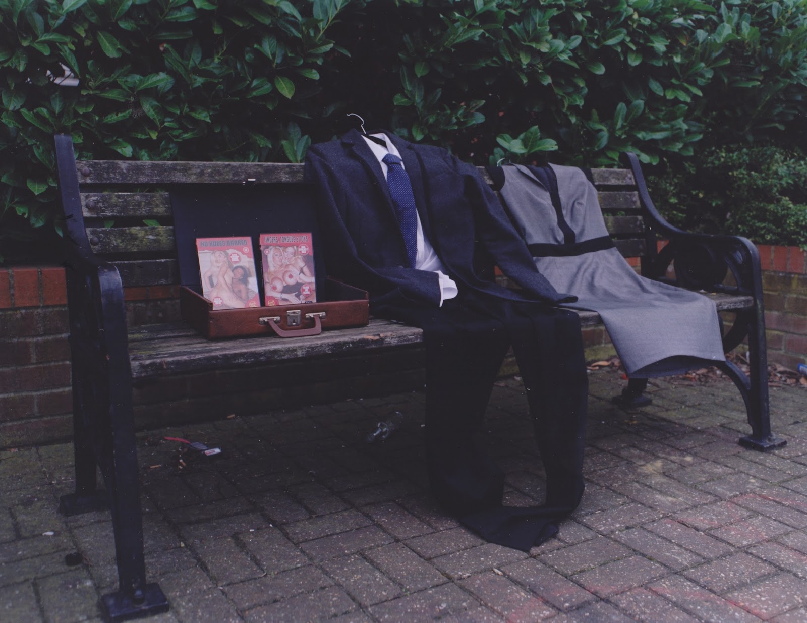
For my shoot i knew that I wanted the presence of people but didn't want to use actual models. When thinking about how to achieve this I thought back to the cadburys dancing clothes advert. In the advert the clothing on the rails comes to life and starts dancing. I specifically remembered the dancing suit and because I am looking at politicians and how they took advantage of the power that they had within their jobs I want to use suits to represent their characters.
<iframe width="560" height="315" src="http://www.youtube.com/embed/wk4U2uJuFAI" frameborder="0" allowfullscreen></iframe>
Ida Taavitsainen
Ida Taavitsainen was a photography student at UCA and came in and gave us a talk on the series of images that she made for her final project 'The Memory of My Wardrobe'. The series is about the relationship between clothes and memory and was inspired by the passing down of clothing within her family. She started looking at stories behind clothing by interviewing those that they belonged to. I felt that this project was linked to our project on waste as she does not see clothing as something to be thrown away and wasted but that they are precious items that resemble people and link back to memories of when they were worn. The props and location of the image link to the memory and relationship of the garment.
Corrine May

I was thinking about doing a shoot in the studio similar to the one that I have planned for outside. At first I candied using models and making it appear to be more of a fashion shoot however I really liked the idea of having clothing as representation on the people that I am talking about so this would be too dissimilar to that original idea. I came across corrine Mays work as seen above and below. She has photographed little house hold scenes that she has created using doll furniture. This could be a good way for me to bring my shoot into the studio. It would give me the opportunity to create a more detailed and intricate scene as I could be able to create whole rooms and be able to afford more probe as they would e on a much smaller scale. The politicians that I am talking about were widely exported on and exposed to the public. By photographing in this way it is as if the viewer is being invasive by looking into their house which I feel has a good representation of their exposure to the public. In some of Mays images she has use dolls but I chose these two mages to look at specifically because they do not. If I was to use this idea of a small hills house studio shoot then I would just use tiny doll size suits in the same way that I plan to use suits in my outdoor shoot. This os not a finalised idea but one that I am considering depending on how I feel my outdoor shoot goes and if I feel the need to develop this.

Shoot 1 (location)
Above are both of the contact sheets from my location shoot. This first sheet shows 4 of my images taken of two identical suits hanging outside 2 similar houses to represent the second house scandal and 11 shots of the male and female suit sitting together with a suitcase of porn to represent the porn scandal. All of the images taken from outside the house are similar apart from the last one that only has one suit and one house in it as I was experimenting with how it would look when taken closer. I did not feel that this images put across the story as there is no reference to a second house. I chose the second images down as it was the straightest and there is a black pole at the bottom of the images which was either too central (so distracting) or too invasive within the image.
The photos taken on the bench are mostly taken from straight on but I also took some from various angles. I also moved the suits around throughout the shoot as the different placements of the suits chanced the appearance of the couples relationship when the story came out. Some or taken of then sitting next to each other with his sleeve upon her leg to show how they stuck together and gave support but I also felt the need to take some with the briefcase of porn between them. The briefcase was symbolic of the exposure of the porn claiming story and by having in between them I was trying to show the strain that the ordeal had upon them and their family which was a big issue for Smith and lead to her resignation. Finally I took some of the womens suit on its own with the case. Although the claim was actually done by her husband it was Jacqui Smith's career that was effected and her name that was dragged through the mud because she was the public figure. I felt the need to also look at showing this side to the story.
In the second contact sheet are my photos of Sir Peter Viggers duck house story. I went to a farm where they had a small lake for the ducks. I hung the suit up on a fence but had a huge problem with the weather. The wind was really strong and constant on that day so the suit was moving and blowing in many of the pictures. I have managed to capture some of these in focus and it is interesting how it has managed to make the suit alive but now looking back I should have changed my shutter speed to make full advantage of this effect. I have taken some images of the floating duck house in the distance behind the suit and also had ducks in the images. I could not get as close to the duck house as I would have liked but I felt some of the images are composed in a way that tell the story quite clearly but others where i have had the large shed like duck houses in the background it is not as clear. I am a lot happier with the photographs of the other two sorries and feel that I could have taken these better so I shall see how they look after printing but may decide to go back and reshoot and possibly find a different location where i can include more the the duck house.
Jacqui Smith Photo
I could not decide if i preferred the photos taken from an angle or straight on so I printed both. I was pleased with the colour and feel that I have managed to achieve good quality prints. Both of the prints were ones of the couple sitting together as i decided that I wanted to represent the couple supporting each other even under all the strain that they were under from the media. I also had the briefcase of porn on the side of the male because I personally think that although Jacqui Smith was the one who was ultimately responsible as she was the politician, it was actually her husband that bought the porn and causes the embarrassment for the family. Out of the two prints I would choose the one below. When the image is taken from an angle the viewer can see the flatness of the suits and it takes away the illusion that they are a person. Also I just feel that the composition is more even and undistorted in the image taken from straight on.


To represent the claiming on a second house i got two identical suits and hung them on gates outside two houses that looked very similar. I made the suits identical to show that it was the same person that owned the both. I chose these houses as they reminded me slightly of 10 Downing Street with the black gates and windows above the door etc.
I feel that the image has come out well it can been seen that the image is intended to be quite symmetrical. A slight issue with the print could be that the colour is slightly faded at the top which was a minor issue but one that i was unsure how to fix and was probably just to do with the weather on the day and how there was more sun hitting the top of the building. This image was taken in Chatham near the university.
Sir Peter Viggers Photo

This is the image that I chose to represent Sir Peter Viggers duck house story. I chose one of the images where the suit was not blowing in the wind and was directly facing the camera. I like the composition of this image with the suit large in the image and in the foreground with the ducks and duck house in the background. I am unhappy with how far away the duck house is though because it is not easily recognisable as a floating duck house and is too small in the distance. Because of the fencing I could not physically get closer so if I were to decided to keep developing these images and this idea I would re shoot this in a different location. I also struggled when printing this image and as you can see above is still quite blue. At first I thought that this might be a combination of the time of day that the image was taken and my accuracy in printing. I realised after printing some of the other images from this collection in my workshop that this was not the case and it is simply my printing. This means that if i decided that I did want to use this as a final print it would have to be re printed.
New idea for studio shoot
Even when I was planning my location shoot I was still thinking of ways that I could translate this concept into a studio shoot. I considered just making a small doll house size version of something similar to what I have done on location however have had an idea to take it visually in a totally different direction. I started looking at collages and have decided to create three portraits of the Smith, Viggers and Malik using this technique. This would allow me to experiment with different art forms besides photography but once I have completed the collages they can be photographed and used for my final prints. I can explore a more abstract way of working compared to my location shoot which I took quite literally in relation to the politicians stories.
Collage research
Karel Teige

My initial thought for this idea is to have a giant suit walking through a city in a way that suggests that they are superior to the city and its rules. I thought that maybe I could build up the city in each collage using different images depending on the story that I am trying to make a comment on. I started by looking at these photomontages by Karel Teige. To the left he has taken a photo of an ancient landscape, taken it out of its original context and rebuilt it into a dreamscape. He has made a series of these images where erotic body parts are seen to be rising out of the ground and a female landscape is created. I Was thinking that I could create this type of dreamscape scene but as a city so maybe overlapping the women's breasts or arranging than to look like houses and buildings for the politician to wade through. Breasts would only be suitable for the pornographic sort but I could also relate this idea to my other two stories by making the city into a pond type structure with ducks beaks coming out of the water to create the illusion of buildings. I could also consider doing something more similar to the image above on the right where the women's legs have been incorporated in with images of buildings. The only flaw in this idea is that for the second housing scandal it would not be making an obvious statement to just use images of houses as it would just look as if they were walking through a town. Houses could maybe be replaced with latter boxes, doors etc however I am still unsure if the point would be as clearly put across.

I was also playing with the idea of replacing the politicians body parts with items that are relevant to their story similar to the image above. Teige has used a house to replace the main body of the person which could inspire my collage of the second house being claimed. I could do with using a ducks wings for example for Sir Peter Viggers and some sort of sex related object or outfit for the Jacqui Smith headline.
Adolf Hoffmeister 'landscape of the photographers'
Above Adolf Hoffmeister has created a landscape of female nudes which is exactly the type of collage that I was talking about to make the city below the politicians feet in. This close, overlapping collage technique could be used not only for my pornography scene but would also work with ducks and housing. I really like this idea of creating some sort of floor/city scape made of images relevant to the three stories that I have chosen for the political in my image to be stomping through. It could also appear as if they are wading through it because these items that they claimed became something that absorbed them and really effected their carriers.
Linder Sterling (tate modern)


I went to the Tate modern a second time as i now had a new idea and remembered having a particular interest in Linder sterlings work. around 1976/77 when Sterling was an art student she started looking at magazines and media prints. she saw that there were publications for men about cars, sport and pornography and women's on fashion and household but felt that style press just did not exist. In the book 'Collage, The Making of Modern Art' by Brandon Taylor it quoted Sterling saying 'I had two piles of magazines, trashy mens stuff and trashy women's stuff... I was fascinated by the fact that as a women I was supposed to be in both these worlds'. I found this very interesting that the idea behind her photo montages were driven by her reluctance to accept the relationship between women and print media and how women are meant to have an interest in one, yet be the interest of another. This lead to her combining images from both which can be seen in the image above. This is one of Sterlings most famous photo montages as it was used for the cover of the 'Buzzcocks' album 'Orgasm Addict'. I also feel that this image is one where it is most apparent that she is making a statement about the expectations of women through her combination of the fetishized female body and the domestic appliance.
I found her work to be relevant to my idea because she uses objects to replace certain parts of the body. In collages I have decided that a want to use the faces of the the politicians I am focusing on but have there body as something related to what they were reported to be claiming for. This brings me back to when i was looking at Karel Teige's image of the women with a house as her house a stomach area.
Another reason i looked at Sterling is because I felt it could inspire collage of Jacqui Smith and her husbands expenses claim for pornography. Her use of sexualised female images gave me the idea to put Smith's head onto some sort of naked female. I could keep this quite subtle by just using a naked female body or make the image appear more comical by using an erotic image. This lead me to look at the image below.

Sterling's piece above 'Untitled Photomontage' 1977 is from her series 'The Secret Public'. This shows a couple masterbating but their heads, nipples and genitals have been replaced item of technology. I have not yet decided how I want to approach the Jacqui Smith collage because although she is the one that was the politician and they expense was on her claims, it was actually her husband and not her that claimed for the movies. For this reason I am not sure if the image should show her, her husband or both of them. If i were to use the both of them I could create an erotic scene similar to Sterlings as this would also make it clear to the viewer that it is a pornographic related incident. A problem with this could be what it could also be seen as quite vulgar. If i was just doing a collage or image with no one specific being featured in the image I would not hesitate to create an image that could be contivercial or seen to be erotic but I am using the faces of
Jiri Kolar
I want to create portraits of the politicians that I am looking at but still need to decide on a background. I have been considering maybe using a collage of clippings and shreds of text or writing. I started looking at Jiri Kolar's work . He has used both clippings of words and newspaper clippings in these two images that I have chosen. I have been considering using newspaper clippings from the scandal but this is going to be something that I shall have to research further as I am unsure how I would source articles from this time. In the images above Kolar has collaged individual words. I could create a similar type collage to this using words that relate to the scandal and the individual stories of the politicians. I wanted the background to be textured however sticking clippings of words will be too flat. This could be remedied by using a similar technique to the image above. Kolar has create an embossed style by having a raised image within the collage.
Tate Modern
I could not find who the artist that did this series in the Tate but this piece really caught my eye. He has written 'Santa claus is not evil there is no need to defend myself against him' repetitively. I thought that this could work as the background for my collage because they have been written in the style of 'lines' that are given to children at school when they have done something wrong. This would be appropriate form the politicians I am looking at because it would be as if you are treating them like they are a naughty child and would be in a patronising manor. Here are some of the lines that I thought that I may be able to use:
.I should not claim for porn
.I must not spunk away your money
.Homes are not buy one get one free
.I should not fuck up for my duck
.I should home people not pets
.I must not ponce for my apartment
.I must pay for properties
Hannah Hoch
One idea is that i could cut out images of the actual politicians involved and used there head within my collage. Here Hannah Hoch has incorporated an image of someones face but has stuck over it to alter it and give it a more animated look. I could play with this idea in my work as I was thinking that i could for example find and image of Sir Perter Viggers and stick a ducks beak where his mouth would be. I could also use this sort of technique for the other two story lines like using house windows for eyes etc.

When looking through Hoch's work I found that in some of her images she has forced interesting textures and colours for her backgrounds. I was considering maybe using the newspaper articles from the incident but I think that by having a background similar to this i could create more texture and covey more emotion through the image using colour. There is also the option of collaborating the two. it would be quite simple to rub on parts of an article onto a coloured paper. I could also achieve tho by putting newspaper in the neg holder in the enlarger and projecting the writing over image in a photogram style. If i felt that the newspaper was too thick and would be too overpowering in the image i could copy parts of the article onto acetate so only the writing would be visible and the rest would be clear.
Peter Walker
When looking through artists that had experimented with collage online i came across Peter Walker. The first image that I came across was the one of Liz Taylor. Although this is not actually a collage piece like the rest of this collection it gave me the idea to use stencilling within my work. Drawing is not my strong point and neither is using different shades of paper to create the illusion of a person which are commonly used but I think that it would be very suitable for me to create a stencil and spray some of my work. This technique could be used to create either the face of my politicians, their bodies or both. Also in his piece 'Free as a bird' He has sprayed onto a collaged page but also created a white base of spray paint before actually using his stencil. I like this technique as it graduated the collage into the stencil but also by using a contrasting colour to the black it makes it stand out more. The drips of the paint are also an interesting feature that I may consider using.

"Free as a bird", Other/ Multi disciplinary, mixed media, 2010
"Liz Taylor in 56", Painting, Spray paint stencil, 2011
Collage

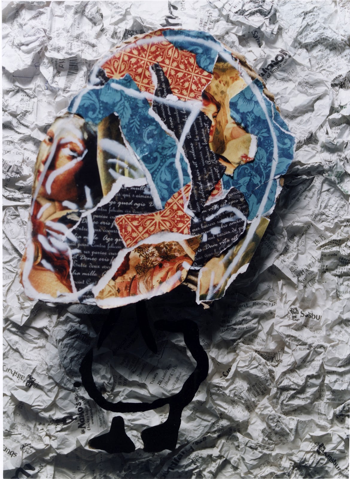
I am going to do three collages as portraits of the politicians that I have been looking at. I did not want to use actual photographs of the politicians but wanted an image of their face that was recognisable. I achieved this by using a light box to trace the the basic shapes and features of the face. I was not 100% sure what i wanted to be with the the bodies yet just that i wanted them to refer back to the scandal stories related to each person. I cut the heads out so that I could place them in different images for experimentation. I have decided to make the head oversized in comparison to the bodies so have copied A4 photographs of the politicians faces. By making them oversized I want them to appear not comical but to make them look slightly ridiculous. The fact that the scandal has been allowed to carry on for all this time is ridiculous but also the fact that these politicians felt that it was acceptable when they are public figures who's jobs are to be representatives and have been entrusted in their positions by the public.


For the pornographic story I thought that it would be suitable to put the head on the body of a naked women. I wasted to explore with different colours and textures so i started with paint.
My colour choice was directly inspired by Van Gogh's painting 'The night cafe'. When thinking about the combination of colours to use this instantly came to my mind. Gogh said "I have tried to express the terrible passions of humanity by means of red and green". I found this to be very relevant to the expenses scandal as 'the terrible passions of humanity' in this case is greed that lead those to spend money that was not theirs to spend, for their own benefit. As i had been looking at stencils in my research i decided to try and mimic a stencil style by making quite abstract images using individual brush strokes and sectioning the body. I put the painted bodies with the heads that I had drawn out but they may be too abstract as they might not be easily recognisable as a womens or ducks body to my audience.


After discarding the idea of painting the bodies of the portraits in an abstract way i looked back to my research of Peter Walker and his graffiti stencil work. I found images on the internet of a house, naked woman and a duck. I traced these images and and then transferred them onto foam board. These were then made into stencils which i planned to transfer onto my image.
To see how the stencil would come out here is a tester of the stencil of the naked women. I have deliberately made the heads oversized in comparison to the body. I am going to collage the heads and use coloured papers so I think that I should keep the stencil more simplistic. I know that I want to create a textured background so the stencil would not come out as clear as it has on the smooth card board shown above. I shall have to think of a way to remedy this problem.

I have decided to spray my stencils onto A3 sheets of acetate. By doing this I can layer the acetate onto of the textured background that I decide on. This way the stencil will come out clearly as it has been transferred onto a smooth surface, but as the acetate is see through the textured background will still be seen. I also felt that the fact the acetate was see through was symbolic of the exposure of the politicians. Once the scandal was revealed politicians (especially the three that I have chosen to focus on) were exposed to be judged by the public.


I bought 3 sheet large square patches of woven fabric in camden which can be seen on the left. I hung my acetate sheets with the stencils on in front of the fabric but the busyness of the pattern makes the stencil harder to see and distracts from it. I only chose the fabric to experiment with as I loved the texture however it has no relevance to my concept and is not in keeping with my image. I was looking at maybe using newspaper clippings for the background of my collage however they would have to be articles and headlines relevant to the scandal. I looked into this but could not find how to source them. I still liked the idea of creating a background collage of something that includes text like
Jiri Kolar does. I then had the idea about maybe using receipts and they are white and therefore would not be distracting from the actual portraits of the politicians but could add texture and is relevant to my concept.

I have decided for my final idea that the background of the collages will be made up of overlapping receipts. I have chosen receipts as they represent the council tax money spend by the politicians. It is also a reference to all of the small claims for things such as food and just everyday items that were claimed for. I plan to cover A3 boards with the receipts so that no gaps can be seen and will then layer the rest of my collage on top of this. To add texture I am going to screw up them up before overlapping them and gluing them to the bored.

I have used the same stencil technique that I used for the bodies, for the politicians faces. I took the pencil drawings that I had already done of their faces, divided parts into lines and sections then transferred this to a stencil as I did before. By doing this the faces were still recognisable and was heavily inspired by Peter Walkers 'Liz Taylor' images. I decided that the head where where I was going to incorporate colour and my main collage. I chose 4 different sheets of coloured paper that I felt complimented each other and collaged shredded pieces of the different types of paper onto pieces of card that I had cut slightly lager than the face stencils. I felt that these papers looked quite historical which I felt was suitable to represent parliament as it is a body of representatives that has been in place throughout history.
Contact sheet
Here is my contact sheet from my final shoot. I was unsure if I wanted to just photograph the collage that I had created and do a full print of them or if I wanted to just photograph parts of what I had made and combine the print with some of my collage at the end. This is why I have taken pictures of the collage pieces in stages. I started by just taking a photo of the background made of receipts. I took one in focus and the other purposefully out of focus. I wanted to look at the soft texture created when the receipts where blurred together but after looking at the contact shed decided this was not a look that was relevant or in keeping with my work.
As you can see I have also taken three images of just the receipt backgrounds with the spray painted acetate sheets over it. The heads would then be added to the prints after. Finally I did shots of the whole collage's when all of the pieces are together. After looking at the contact sheet I was still unsure as to how I wanted my final prints presented in relation to the collage so decided to print a variety as I could them compare both the flat images and those that included 3d elements.
Prints
I started by printing the background of collaged receipts. I started with this because if I decided to use this print I would simply need 3 of the image and would layer the rest of my collage on top of it. I felt that If I only used this as my print and worked onto it, it would look as if I had made no effort within my shoot and had taken the easy option. Although I like the idea of collaborating both printed photos of my collage and elements of my original collage I feel that is as a print is too simplistic and the quality of the print would be lost under the acetate sheets.

I used acetate as I was intrigued too see how it would look if a slight reflection of the lighting could be seen. I used the acetate originally to symbolise the exposure of the politicians involved in the scandal but this would not be able to be seen if there is no reflection. In the image above there is a reflection of the light but I did not actually like this within my image. It just looks like a white square and a mistake that I had made during the shoot so I decided against using this idea for my final image.

I felt that the receipt image alone was too plain and would be lost under the acetate but was still playing with the idea of incorporating my collage in some way. I think that the image above is the happy medium between the two. For my final prints I could use the three images that I have taken of just the stencil on acetate onto on the receipt background but physically attaching the collage heads to the prints afterwards. This would keep the texture and 3D elelment that I did not want to be lost in a flat print but still having the actual print as the main part of my image.


I have written above about how I did not want the 3D element and variety of textures (that were present in my original collage) to be lost within a flat print. It is hard to tell the difference when looking at the scans on here but above are three of the prints where the whole collage has been photographed and none of the original would be combined with it. I feel like it takes the character away from the images so have decided not use these as final prints. There is also the issue the the top left section of the face on the duck portrait is slightly out of focus where I have captured it at a point where the air con blew the paper. I do not want to use an image that is slightly out of focus for my final print as it would ruin the collection of images and I'm not happy to submit it.

When printing the flat prints of the collage I wanted to experiment by zooming in on the images so that the frame and edge of the receipts board could not be seen. I was not as keen on this as I was on the prints that included the black framing as it gave the white of the receipts more of a clear finishing point and contrasting edge. There is also the factor that the portrait of the house has the head hanging over the edge of the paper so this would mean having to cut of some of the head. This would look ridiculous especially in comparison to the other two images in the collection.
Final Prints


For my final prints I have chosen to use the original collage heads and attach them to the prints of the receipt background and stencil combo. I decided on thing so that I did not use the 3d element to my work but still the majority of the images is still a photographic print which was the criteria for the brief. I have used 12 by 16 paper as this was the closest size to my original collages before I photographed them. I felt that these were images that looked better in large print and also would not be also to combine the prints of my collage with original elements of the collage if they were completely different sizes. I am pleased with the prints as I feel that I have managed to achieve the same tones and colouring within the prints and stand firmly on my decision to attach the collaged heads. After looking at artist like Linder Sterling and Hannah Hoch where they have cut out images and overlapped and stuck images together I felt that by having a flat print of the image it was no longer a collage but simply a photograph of one. By bring some of my original collage into it I have managed to reform it back into being one again.
I feel that I have achieved my goal of making the portraits slightly ridiculous. When looking into this topic I kept finding myself thinking how utterly ridiculous it all was and how it could have ever been allowed to happen. I wanted to try and portray this in my work and show the 3 politicians in such a way they also made then appear ridiculous. It could be said that I have almost humiliated them by using comical bodies that relate to their stories within the scandal and giving them abnormally large heads but I felt this reflected the humiliation that they faced when exposed by the media.