Wednesday 30 November 2011

Body: Tom Williams

 Model Choice

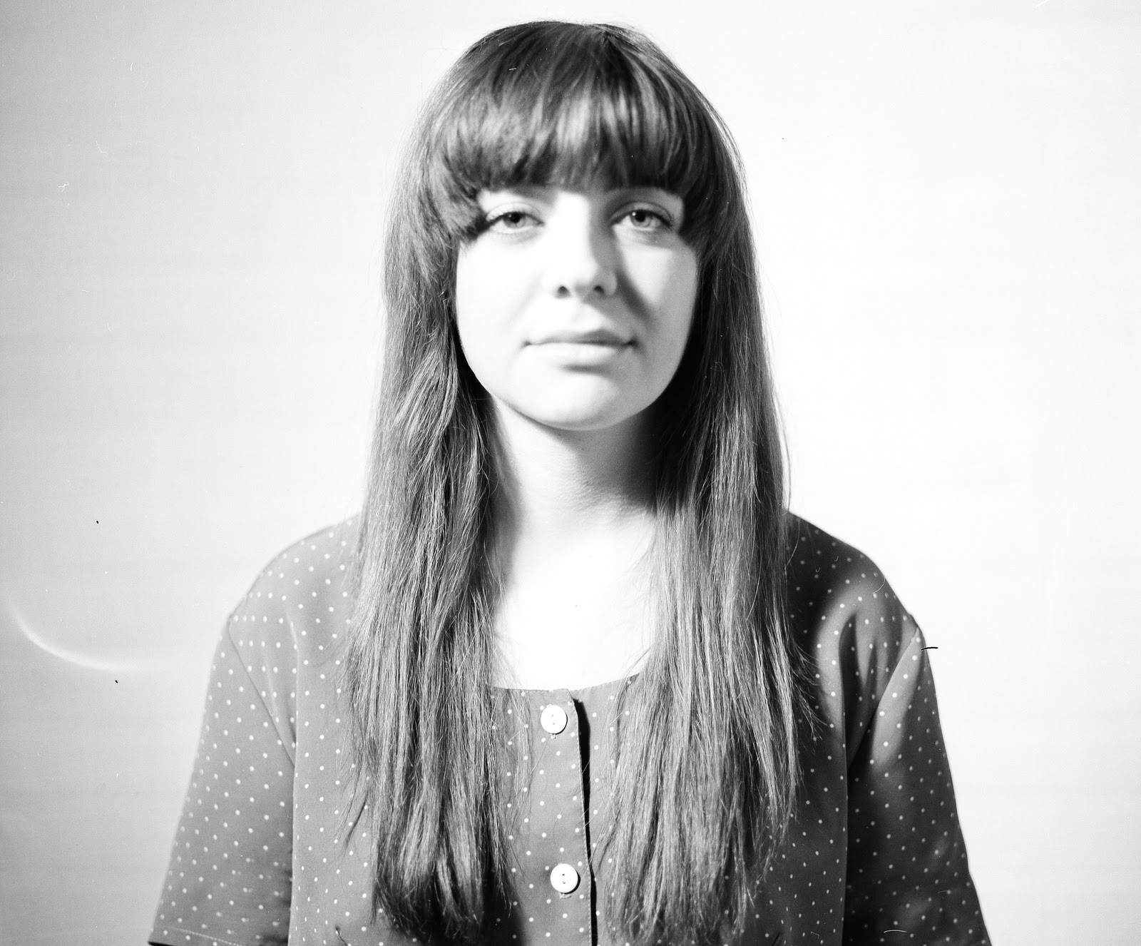
For my Portrait shoot I have chosen to photograph Tom Williams who is also a student at UCA that studies fashion design. I chose him because he has an interesting style and felt that his creative opinions and appearance could inspire me for this project. 


Interview with Tom:

I spoke to Tom to see if he was willing to be photographed and then arranged to meat up so that i could find out more about him. The first thing that i asked to was what inspires him and his style. He gave me this list of people that i could look at:

.Boy George
.Marilyn Monroe
.Lady Gaga
.Andy Warhol 
Edie Sedgwick
.David Bowie
.T-rex
.Grace Jones
.Thierry mugler

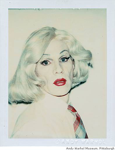
I have already looked at Andy Warhols drag self portraits but Tom has told me that it may benefit my project to watch some of his films that feature 'Candy'. The transexual actress starred in films such as 'Flesh' and 'Women in revolt'. Tom has a keen interest in Andy Warhol as he "loves what he stood for" and feels that "he changed art". When i asked Tom what his aspirations were and where he wished to eventually be he expressed his desire to be a fashion designer but also to work with art, animation, film etc. He hopes to be a creative designer and explore all areas as Warhol did.
I have decided to first look at Boy George and Lady Gaga as they both have very unique styles and I hope to be inspired by portraits of them for my own work. 


Boy George:


Boy George was a singer song writer who's career started in the 80's and was part of the group 'Culture Club' which lead to a solo career in the late 80's. Boy George is known for his unusual sense of style and experimentation with both his hair and make up. I have not managed to find who the photographer was for the image above but felt that it was an image that I wished to explore further.

Firstly I  would like to look the styling in the image. His make up is subtle but really enhances his features. If I decide to ask Tom to wear make up I will use it in this same way. Women use make up to enhance their best features and in some cases a sense of glamour. I feel that Boy George's make up is not 'drag' like but is part of his style that enhances his beauty. The image above really shows this he is shown to be in a casual position and not making eye contact with the camera re-enforces the fact that it is not a performance.

Boy Georges hair was also an important part of his look and I have noticed that tom also likes to experiment with his hair by braiding in extensions etc. Hair could be an interesting tool within my images because hair can be used to frame the face or show inspiration from specific era's in Toms case. I have spoke to him about how he likes to style his hair when going out and we have decided on a quiff as it is bold and will pull his hair off his face which I felt was important.
 
I love this photograph taken of Boy George in 1984 for the front cover of Cosmopolitan. This image is very different to the one above. He has been made up and photographed in a way the makes him look like a women. Aside from the obvious hair, make up and clothing, the body positions and photographic choices have added to this theme of femininity and beauty. The way that hand is positioned is very delicate but has been made a subtle feature by having the glove the same colour as his clothing. Also the use of the glove is clever as it covers his hands that would otherwise masculine and out of place. 
The back drop used is red which is interesting as I have not considered incorporating colour in this way. They have used red which in this case I think symbolic of passion and sex appeal. Although Boy george was I feel quite beautiful the choices made in this image very cleverly made a successful beauty shot of a man imitating a women which looks as radiant as the photographs that they would display on the cover that is of women.  

Lady Gaga:


Lady Gaga is known for her diversity and extreme style. This has made her a fashion icon and is therefore frequently photographed. I have decided to look at some images of her as she is an inspiration to Tom and i personally find her style very interesting. Hopefully the images can inspire my photographic choices or atleast my styling choices.


The image above was photographed by Mariano Vivanco. This was taken when Gaga had her cheek and forehead implants in. This caused her face to be very angular and has inspired the styling and photographic choices within the image. Many elements of the image have been made to angular such as her box fringe, bun, collar, eye and lip make up and most importantly her hand. I like the idea of the image being sort of themed. It is interesting how many of the choices made for the photograph seem to have been inspired by her new implants. The use of block colours is also another feature of the image that i like. Within my own shoot i could use colour to direct the eye to parts of Tom that i wish to draw more attention to. I could even achieve this in a way even if i do my portrait in black and white as dark lipstick for example would still be visible as it would be a noticeably darker shade.


Both of the images below and above were taken by Leslie Kee. I have chosen to look at these because they are from the same shoot so the styling and make up are the same but i wanted to look at how the photographic choice and direction has made the images so different. The most obvious difference is the the image above is in black and white. Although Gaga is wearing the same amount of extravagant accessories in both images i feel the they are made less distracting when photographed in black and white. By taking away the colour of the accessories more attention is brought to the face. This is something that i should keep in mind when shooting tom as it is likely that i am going to style him in a way that could distract from the face.

Secondly the hand positioning, although both having on hand on the face are very different. By having the hand gently resting on the face and having the finger graduating down Gaga looks much more delicate.Also the tilting of the head makes her look softer.In the image above her head is held upright and is framed by her hand holding her chin.This is an unnatural pose and does not create the softer, feminine look the the image below does.

The last thing that i wanted to look at was facial expression. In both images Gaga has her mouth open however different emotions are shown by subtle changes in her mouth. I the image above her mouth is open wider and this combined with the widening of the eyes makes her look surprised. In the image below her mouth is open slightly less and by placing her finger slightly on her lip and having her eyes more relaxed she looks more seductive. Subtle differences in expression will be very important when i am directing my shoot as the main focus will be the face and a slight change in expression could give the image a completely different meaning.
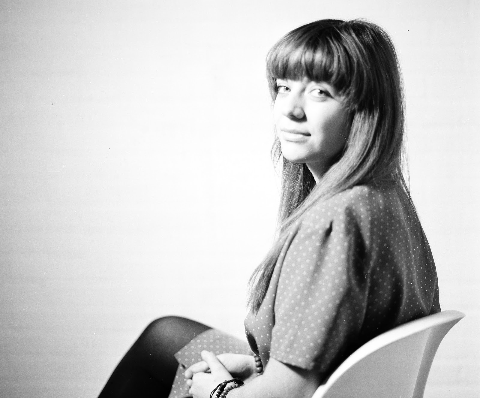


Edie sedgwick:


Edie Sedgwick would have been classed as what we now call an 'it girl' in the 60's. She was an American heiress and socialite that became best know for being one of Andy Warhols 'Superstars'. She became known as "the girl of the year" in 1965 after starring in several of Warhol's short films. Tom loves the style of the 60's and Andy Warhol therefore an admiration for Sedgwick is easily understandable. 

Body: Practise shoot

Practise shoot

We were given the task of photographing our partner in the studio. We had to show 4 emotions within the photos which were vunrabile, intimate, aloof and powerful. This was to help us experiment with lighting and give us more experience with directing. Below i have uploaded some of the photographs from the shoot.


This image was meant to represent intimacy. as a group we really struggled with this emotion, not just modelling but directing. I feel that this photograph represents pride and power more that intimacy. Her upright posture and confident expression directed straight at the camera gives this impression. The lighting is too bright and therefore burns out some of the models face. If I were to do this again this would be the main element that I would change.  


This photo was meant to represent vunrability. This is shown by the models expression as she has tilted her head down and and her eyes are also looking down. I decited to have the model facing the light slightly so that the might falls on her face. I felt that this would emphisise how pale her skin was making it look white which could make her look pure and vunrable. I am now thinking that it could have been more appropriate to have had more shaddowing on the face as it would appear more melancholy.

This image had no relevance to the task but after taking the necessary photos I just played with comical and dramaic expresssions to use up the film. I have been told that a portrait is more effective when a serious expression is pulled so I felt that I should challenge this myself. The model that i have chosen for my final portrait shoot is quite excentric and therefore I could photograph him with more dramatic and playful expressions. This may be more suitable to his personality as it may be how he wishes to portray himself to others. After photographing the image above i can see how pulling playful expressions can draw away from the point that you are trying to make with your photograph and may not be appropriate when you are trying to reveal someones personality in more depth.

This is my favourite image out of all of them and most similar to what i hope to achieve in my final image. I think that I will position my model in this way for my final shoot because I find it to be the most intimate. I also want my model to be gazing straight ahead into the camera. By doing the image in black and white it strips down the person and minimises distractions. I am going to do a test shoot using my actual model and try and recreate this effect.

Tuesday 29 November 2011

City: London test shoot

London

St Pauls Cathedral


I chose to mimic this image taken of St Pauls Catedral in London during World War II. I am going to try and take a black and white image from the a position that will be as similar to the one above as possible.


I took some digital shots from various positions to try and find the one that was the most accurate. There is now a brigde that leads to the catedral that was not there during the war. I took this image above whilst standing on the bridge but it was not suitable for a few reasons. Firstly the catedral is too close in comparison to the original image. This is an important factor but also the fact that so much of the actual bridge and the public crossing it is featured in the image is very distracting from the actual cathetral which is meant to be the main focus.


I decided that maybe the image could be taken from the other side of the building. This was not possible due to how many buildings were in the way. I thought that maybe from high up i could get a better image but did not find anywhere higher up that I could photograph from. On street level the building was difficult to even see so I went back to the side that I was originally to try again.


Eventually I realised that I was to cross over the bridge (that i took my first practise shot on) then stood infront of the tate then the view was very similar to that of the original image. This was taken with a film camera and could possibly be used as a final image. I think that there is too much sky in this image though but that could be fixed when I go to print the image. I have to return to London to do my other shots because I had difficulty with the camera on the day so may re shoot this image and compare both attempts.


Saturday 26 November 2011

City: task

The Flatiron Building

Our task it to analyse and compare the six images bellow which are all of the flatiron building. This sky scraper is located in Manhattan, New York city and was completed in 1902. There were mixed reactions to the building at the time.

Edward Steichen:


This image of the Flatiron building was taken by Edward Stiechen in 1905. The main focus point of this image however is not of the building but the scene below. This makes the image similar to Coburn and Stieglitz's photos as the building is also not the main focus. The foreground is high contrast so the attention is brought to the foreground which suggests that the is putting forward a message about society at the time and a sense of class in the area in which the building stands.

Alfred Steiglitz:


This image was taken in 1903, just one year after the completion of the building. There were mixed reactions to the building but by the way this is photographed you can assume that Steiglitz was in favour of the Flatiron. The building is in the background of the image and the detail is lost in the mist. This give the illusion that the building it quite subtle and therefore has not imposed on the city.


Alvin Langdon Coburn:


This image taken in 1912 is similar to Steichen's in the way that there is a street view which bring focus to society surrounding the building at the time. Coburn has photographed business men dressed professionally and the fact that this is out of focus is presumably to represent the pace of the city. 


Walter Gropius:


Walter Gropius took this photo in 1928. This image is the first so far to look at the buildings structure as apposed to it surroundings. Berenice Abbot also has a similar approach when photographing the Flatiron building. The angle is what is most intruiging about this image compared to the others as it draws attention to the height and shaping of the building.

Walker Evans:


Walker Evans's image of the Flatiron building taken in 1926 is very different to the other in the way that the building is the main focus, however only a small section has been photographed. This image is more of a composition of the building and architecture and objects surrounding it. It is also the only image that is taken in colour which could be said to be a more modern approach to photographing the building.


Berenice Abbott:


This images was taken by Berenice Abbot in 1938. The building is the main focus of this image as it is in Gropius's and is also in focus.both images look at the building as an architectural piece and present the structure. The main difference between the images is the angle. Although both are shot looking up as if the building is looming over you slightly, here the building is photographed upright. This is more accurate to how the building would actually seen when approaching it whereas it seems Gropius is making a slightly more artistic statement.

Wednesday 16 November 2011

Body: Jeffree Star

Jeffree Star

Jeffree star is a Dj, singer songwriter and model that has his own clothing range. I have used to have an interest in his music in my early teens and felt that he would be perfect to look at for this project. He is said to have work his mothers make up from a young age and began to cross dress properly in his teens. This led to his becoming a make up artist and started to build his profile as a model. His music career started with his self released electronica/ hip hop music with explicit lyrics on myspace. social networking made him very popular and he would frequently blog about his self image and would display many images of himself. These images were both self taken and professionally shot. By doing this he would boost his profile


I have chosen to look at the two images above for the same reason. They both show the process of what Star has had to do to get the result of how he looks not. It is similar to the way that Warhol was not subtle about showing the fact that he was a man dressed as a woman. Star has had a lot of surgery on his face to make himself appear 'beautiful' and to give him more feminine features.This story is told in the first of these images with the drawing on the face that are meant to mimic the markings drawn just before plastic surgery.

In the second image He is wearing a wig but an incomplete one where the bald cap and sections of hair are clearly visible. Jeffree star often refers to himself a fake in his music and presents the elements of him that are 'fake' with pride. This is shown in this image as it is quite clear that his hair is not real but is still vibrant. 


Jeffree star always tries to come across as glamorous which is quite typical of transvestites, drag queens etc. To take on a female persona many features much be enhanced or changed such as wearing fake eyelashes, drawing on new eyebrows and wearing wigs. This can look quite extreme when put all together on a man but but Star embraces this and in his photos he will have accessories like gucci bags and sunglasses to seem glamorous. The image above is more classic as he has chosen a jemmed fascinator with a veil and feathers.I think having feminine accessories within these images enhances his appearance and could maybe transfer this idea into my portrait. 


Because Jeffree star promoted himself mainly on networking sites like myspace and facebook he uploads a lot of images that he has taken of himself as many people do. This caught my attention because these images are more intimate. They are taken by him either in his room or dressing room by himself and are personal in the way that this is how he wishes to present himself to the public. I could achieve this same effect in my portrait images by having the models arm outstretched to the camera as if they are taking the image of themselves. This would then be showing that this is how they are choosing to present themselves.

Body: Andy Warhol

Andy Warhol


Andy Warhol is a very celebrated photographer that is famous for his pop art style, celebrity portraits and also his self portraits. In the early 80's Warhol collaborated with photographer Christopher Makos. They worked on a series of self portraits of Warhol in drag. He had an ongoing interest in drag queens  and in general the aspect of artificial role play which you could even say  he looked at in his celebrity images of people such as Marilyn Monroe.


This series was not about revealing ones self it was about presenting a mask. I find this idea of creating a new identity for yourself very intruiging. Men dress as women for different reasons but Warhol has decided not to focus on a female alter ego or a reasoning for the the change in appearance. He is exposing the vulnerability of feeling to need to present yourself in a way to mask who you are. 


The image above is slightly different to the others within the collection. He is not trying to trick the observer into believing that he is a women which could be said for the image below. He has deliberately included his broad masculine shoulders in the photo and his lack of breasts is also obvious. The angle of the camera makes his heavy set jaw quite prominent aswell which is a feature that is thought to be very manly.

I think the he has photography this in this way to make it very blatant that he is a man impersonating a women to reinforce the fact that a front is being put on.


Warhol Has used a plain white backdrop for all of his images within this series which is think I may choose to mimic when I do my own portrait for this project. It means that all of the focus is draw to the model and it work particularly well when he wears bright lipstick and bold wigs as seen in the image above. Also the whitening of the face draws attention to the brightly coloured sections of the image which are the fake elements that create his new persona.

Tuesday 15 November 2011

Body: Brief and ideas

Brief:

For this project we are required to explore portraiture. We have to find someone to model for us that we are not friends with so this can be a random person off the street, a friend of a friend etc. This is quite a daunting task however will be a good experience as we will not develop as photographers if we limit ourselves to just taking photos of our friends. There has to be a reason why we have chosen the person that we are going to approach. This can be a general interest in a person and what they do or they may just fit the criteria of the idea that you wish to base your work on.


Ideas:

I was excited by this project as I love photographing people. I was unsure as to which direction I wanted to take this project however. I knew that I wanted to look at 'the surface' weather that was stripping the surface by photographing someone without any make up or glamourisation but in their raw form or by photographing someone in the superficial form.
If I chose to take a raw approach then I shall look at photographers like:

-Malcolm Veinville


-Corrine day


-Paolo Roversi


If I decide to go to the other extreme I want to look at drag queens. I have always found them fascinating and will allow me to explore alter egos and performance. I am most likely to look at photographers such as:

Andy Warhol:


Curently this is the only potographer that comes to mind but will look into this topic in more depth if i take this idea further.

City: Trip to london

Francesc Torres
As a group we visited the Imperial war museum. This trip was very appropriate for my 'City' project within the second part of my study of environment photography. I am going to carry on with the work that i started about the effects of WW2 in London that was not suitable for the landscape project.

The first photographer that we looked at was Frances Torres. His exhibition 'Memory Remains' Was a collection of 150 projected images to mark the 10th anniversary of the attacks on september 11th. The images were of items and materials that were recovered from the World Trade Centre after the attaccks. 
 

The items photographs range from personal belongings to steel girders and burnt out viacles. These were all stored at hanger 17 at JFK international airport. This was a personal project for Torres as he lived only two blocks away from the twin towers and had to watch the destruction. He said that there was an emotional power of what remained and that 'though remains of history memory remains' which beautifully sums up the intentionas of this exhibition. 
 

Although i did not find the images within this exhibition asthetically pleasing i could fully appreciate the point that they were making. I feel that its is very admirable to photograph the remains as a mark of respect because although the even has ofcourse not been forgotten, by photographing the remains this shall remain remembered. I personally found the images of peoples personal belongings most emotional because it bring to light the realisation that although many died they were individual people.

This links to my project idea as i hope to look images of remains from the bombings in the 1940's. This idea however is not as emotional as Torres's work as this is about looking to the past and capturing the remains so that the momory is not lost. With my project I want to look at the development and how London has been reconstructed since then.


Don McCullin


The other exhibition that we looked at was Don McCullin 'Shaped by War'. McCullin was a photojournalist and was sent to document wars and conflicts across the world in places like Vietnam, Lebanon, Cyprus, Berlin and Cambodia. His powerful collection is shocking but is to show the 'truth of war'.
McCullin put his life in danger on a regular basis as he would live in the same conditions as the solidiers and to be able to take his photos he would have be be amongst the fighting and gunfire. One thing that gave me a great respect for this photographer is that he said that it felt good to feel pain as he was photographing others pain as he had clearly been injured over the years due to the nature of his work. Although this may seem slightly insane it shows his great respect for thoses that he was photographing. His work is quite intrusive in the way that he is capturing people on their death beds and in moments of extreme despiration and i feel that the only way that he has managed to do this in a repectful manor is by  becoming a part of what he is photographing and completely surrounding himself in these situations.

The image above was of a family after the news of a death of a family member.McCullin has managed to capture an extremely raw moment. I think this is what makes his images so powerful.
When human beings are suffering, they tend to look up, as if hoping for salvation. And that’s when I press the button."- Don McCullin. To me this quote shows that although he can never predict what is about to happen, his images are well thought out and intentional.