Friday 30 December 2011

Environment: City

Joel Meyerowitz

After looking at Francesc Torres's work on 9 11 I wanted to look at more work from the attack that would be more relevant to my project. I came across Joel Meyerowitz's series 'Aftermath' which was a nine month project that documents the clean up of ground zero. He was the only photographer that managed to get permission to photograph on the sight. The perous of the series is to serve the 'thousands that lost their lives, but also celebrates the tireless determination of the thousands of workers who assisted in the clean up process. 

'Aftermath'


I found these images very powerful because although they are of the remains of an attack that killed thousands they are not taken to appear solumn. The celebrations of the workers is very evendent as these images so the people and tools at work and I feel that their hard work and dedication shows great respect for those that died and were affected by 911. By having the machienes and people in the process of working also shows development which is part of my project as I am looking at what remains and has been restored since the war time photos.

There is a dark element to the images with the burnt remains but the blue skys in the background are idealic and the modern buildings behind stand are portrayed as tall and strong with the angle that they are taken from. This gives me the impression that the message that even though the event was tragic and a a huge impact, America still stand strong and can overcome it. In this image there is alot of light reflected off of the centre building. This building is also the highest. This may not be the photographers intension but my first thought was that this is a reference to heaven. As a christian country the belief that the victims of the attacks are at peace and have gone to heaven would be the most common and comforting belief so referencing heaven and 'walking into the light' would seem very appropriate
 

Wednesday 28 December 2011

Pastiche

Pastiche


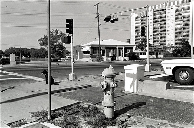
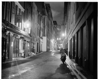
For this pastiche we were given the three images below to choose from that were all relevant to our city project. At first I wanted to do Struth's image however it would be practically impossible because the only place that I could think of that looked like this is in London but it is highly unlikely that you would be able to achieve a shot in London in the day time with no people in it. Also It is currently winter so the weather conditions would stop me being able to achieve the came lighting and perfectly blue sky. I discarded the idea of  creating a pastiche of Friedlanders image because i know of no where that looks remotely similar. I chose Brassai's image 'Paris after Dark, No.27'. There are many back streets in London that are similar to this one and I have never really shot at night so I felt that this would be the most beneficial for me to pastiche.


Thomas Struth, 'Bukseo Dong, Pyongyang, North Korea', 2007


Lee Friedlander, 'Albuquerque, New Mexico', 1972


Brassai, 'Paris after Dark, No.27', 1933

Brassai


Brassai came to Paris as a photo journalist in 1918. He was said to have fallen in love with the city and explored its 'people, places, and things' though his photos. His photos where not idyllic but of the real backstreets of Paris and exposed the city in a way that caused controversy. This is something that I must keep in mind when looking for my location as it can not be too pristine. 


Contact sheet


Above is my contact sheet. I went to Covent garden and back streets near Leicester square in London. I took images of three different streets. The images were quite dark on the contact sheet and I was still unsure which would be the best to use so scanned in three of the negatives below.

Neg scans


I chose this location as it was a side street with a neon sign. This image is far too bright compared to 'Paris after Dark' due to the street lighting. Also I have lost the detail of the writing of the neon sign which says 'sushi' . I fell that this street and sushi sign represent an essence of class that is not right for this pastiche as it contrasts with the idea of a back street with cheap hotels in France.


This location suitable in the way the it was quite a grotty back street in central London however I did not get the same dark mysterious vibe that is present in Brassai's image. I did nit feel that this image was at all suitable so have decided that i would be unable to use this even if it could be darkened when printing. 


I am going to choose this as my final image. Although there are no neon signs there are a row of signs and lights together so the same type of effect is created. The wet pavement is another feature that I have managed to mimic which was more luck than anything as it started raining as I was scouting for my location. I felt that this image was also alot darker that the other two but I would still be able to have the contrast of the brightness of the signs and white shine on the pavement when printing by increasing the contrast. Although the original image does not have any bollards in it I think that they make the street appear more narrow like the one in Brassai's.


Final print


Tuesday 27 December 2011

Appraisal


Critical Appraisal: Body

For our body project we had to focus on portraiture. We had to find a person that we found interesting or relevant to a topic that we wished to focus on. It had to be someone that we didn't know and I chose Tom Williams who also attends UCA. I interviewed him and based all of my research on his interests and icons.


Research:


Tom Has a very flamboyant style and will occasionally wear make up, extensions etc. He also told me that he loves Andy Warhol and his work so i started by looking at Warhol's collection of drag images. In the photos he wears bold wigs and make up however it is still very clear the he is a man. I then looked at Jeffree star who looks at the superficial aspects of being a transvestite. The purpose of researching both of these people was to help me choose what sort of angle i wanted to take when making the decisions for my own images.
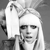
Tom is also a fan of Lady Gaga. Although styling is a huge part of her appeal I also looked into her expressions and positioning.   


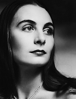
 After looking at men who had explored beauty in different ways I decided that I wanted to take a beauty shot for my final image. The image of Boy George to the right inspired my work as although he is clearly wearing make up, he naturally has traditionally feminine features and the image is very casual. For my lighting reference I chose to look at Halsmans image of Ricki Soma.I felt that the lighting really portrayed beauty and was very flattering for the model. 


Contact sheet:


I originally wanted to use one if the images above. I felt that the poses were strong and the lighting was flattering for the model. I also managed to get the background how I wanted it and the pattern in the outfit really helped to show Toms character. I made a mistake with the lighting and over exposed the model to too much light. when printing I            managed to get some detail back in the hair and face but the images were still far too bright and unable to be used.


I had planned a shoot with another student at the uni as a back up shoot as I was unsure if tom would be able to make it to the shoot. I chose him as I was trying to achieve a beauty shot and felt that his features would be perfect for it. After making mistakes with lighting in my other shoot I managed to achieve better lighting in this shoot and did not over expose the models face to the light. Many of the shots were of the model looking towards the light as  I felt this was the most flattering use of shadows on the face but also tried a few shots from other angles. 

Final Image:


I chose this as my final image. Although I originally did want to use an image of Tom I felt that Brendan's photoshoot was just as relevant to my research and was mainly inspired by the images that I found of Boy George and Halsman's photo of  Ricki Soma. I have put mascara, blush and lip gloss on the model to accentuate his features but kept it subtle as like Boy George he has very strong and classically pretty features. I have the model directly facing towards the light as it creates the most flattering shadowing across the face. This is why I chose this image as aposed to the others as I did experiment with slightly different positioning but it did not work as well. I chose the focal point of the image to be his eyes as they are the most expressive part of the face.I am pleased with my final image and the only thing that I think I would do differently if i was to re do the shoot is to make the model wear slightly more make up as it would be more suited to Tom character. 


Portrait final shoots

Final shoots


For my final shoot I was unsure if my model Tom would be able to come in so I planned for another model to come in aswell. Although I have focused my project on tom and his interests I felt that I could use all of the research that I based on him as inpiration even if it was on another model. Tom managed to come in for the shoot in the end so I did two final shoots, one with each model.

Contact sheet: Tom


I was unable to do a test film due to the cash machiene being broken and having a limited time with my model. This meant that I only managed to do one film and was unsure s to how exactly it would come out. I tried different poses with the model to try and capture both natural and posed images.

Neg scans:


I chose these two images but could quite clearly see from the neg scans that I had badly over exposed the light on the face and the hair was nearly all burnt out. I still wanted to use the image on the left as a potential final image but would have to see if I could fix my lighting mistake while printing.

Prints:


 This is the images that I was hoping to use as I feel that the pose is strong and flattering for the model. I managed to get the background how I wanted it and the pattern in the outfit well when I increased the contrast. I got some detail back in the hair and face but it is still far too bright and unable to be used for a final print. My other issue with this picture is that the right eye is slightly out of focus which is the one that is most visable.

 I chose this image next because the focus was better and less of the hair was burnt out but stll couldnt get it to a standard that was good enough. I also did notfind this pose as flattering as the last one so would not have been happy to submit it as a final image.
 I started doing prints for this image as the lighting and pose are quite dramatic but found that the image would need to be darkened but with the dark lighting on the eyes they would becaome far too dark. This made this image also unable to be used.


Shoot 2


Here is the contact sheet from my second shoot with my other model Brendan. I chose him as I was trying to achieve a beauty shot and felt that his features would be perfect for it. After making mistakes with lighting in my other shoot I managed to achieve better lighting in this shoot and did not over expose the models face to the light. Many of the shots were of the model looking towards the light as  I felt this was the most flattering use of shadows on the face but also tried a few shots from other angles.

Neg scans:


Here are four of the negatives that i have scanned in. I was unsure as to which pose to use so I scanned in four that are all at different angles. I like the facial expression and overall composition in the image on the left but there is very minimal shaddowing on the face which I require for my final image. We did one face on shot as shown on the right but the same as in my test shoot I felt that it was not put across an element of beauty.


The image on the right is facing away from the light and as much as I find the expression on the models face interesting I am not sure if it would be suitable for my final image as it doesnt portray any of the factors that I had taken from my research. I think that I shall choose an image looking towards the light because of the dramatic shaddowing on the face.I may however not use this image specifically.


Prints:


I decided to priint a few of the images as I was unsure as to which one I should use as a final image and wanted a selection to choose from.

Final Print

I chose this as my final image. I did intend on using an image of Tom as my final print however none of the photos were to a good enough standard. Brendans photoshoot was just as relevant to my research and was mainly inspired by the images that I found of Boy George and Halsmans photo of  Ricki Soma.

Monday 19 December 2011

Portrait: test shoot

Test shoot

I did a test shoot using the lighting that I intend to use for my final shoot next week. I used a middle aged man and put lipstick on him and filled in his eyebrows with eyeliner to make his features more prominent. I was not 100% sure If I was looking to create a subtle but femine look within my shoot inspired but the images I found of boy george or a more theatrical approach inspired by Andy Warhol's styling. In this shoot I felt the make up, although not alot of it, was more theatrical and this works well with this model becasue he is so blatently masculine but has made me realise that for my final model a more subtle make up selection would be better suited to his face.

Digital shot:


I much prefered this image in colour becasue the red is the only bold colour within the image drawing the main focus to the lips.

Contact sheet:


I did not move the lighting throughout this shoot as I knew exactly how I wanted it it was just a matter of experimenting with how the face should be angled towrds the light to create a more effective beauty shot. With a face on shot the idea of beauty is lost as half of the face becomes completely black. Many of the images above are similar but I have found that having the model direct their face towards the light but without being a profile shot allows the light to fall on the face in a flattering wy but still create a dark shaddow one side of the face.


Final images:


I do like these images especially the one in the centre as the subtle smile really shows the character of the model however I think that in my final shoot I will have to watch out for making the shaddowed area too dark. Also the face may also be overexposed to the light which will burn the detail out. The lighting on the background is just what I was aiming for though so will have t try and achieve this again the maybe reposition the model and the lighting slightly.

Sunday 18 December 2011

Appraisal


Critical Appraisal: Landscape


For this Environment project we had to produce a collection of three landscape images. I started by looking at development in London and started researching how buildings had developed and been re built since the war. I was informed however that is idea would be better suited to the second half of this project which is based on the city.
  
War Photo
 
I then changed my idea and started looking at how we don't always appreciate landscape. This lead me to look at Elina Broterus, Michael Wolf and Aliki Braine. Elina Brotherus has done a large number of self portraits however locates many of then in traditional landscape settings. This lead me to look at traditional landscapes and I then looked at Wolf's work which blocks out much of the landscape. This gave me the idea to photograph traditional scapes but block then in some way to show ignorance to them. Aliki Braine really re enforced this idea as she physically hole punches away the landscape so that it is not visible.

Elina Broterus
  Michael Wolf

Michael Wolf
Aliki Braine
 
  Contact sheet

Above is the contact sheet from my first attempt at this shoot. I chose three of the negatives from this selection to damage in some way. I decided to damage them in three different ways and therefore burnt, scratched and draw on them. We decided at my review to just use this as a test shoot as they were more of an experiment than a well thought out set of images.


 Image 1
 Image 2
 Image 3


 I have not yet managed to scan in my contact sheet from this shoot but have got the negative scans below. I started the shoot with the intention of carrying on with the same idea as before but with better landscape images but then took inspiration from the way that Michael Wolf uses focal point blur out the background.


 By using the idea of using focal point to make the landscape unclear I have managed to still show landscape as unseen and unappreciated . In each image I have plantation in the foreground that I have focused on to contrast with the lack of visibility of the landscape. I feel that my concept is quite evident and my only main concern about the collection of images is that the third image is alot darker than the other two. It has been photographed in the same way but I think it stands out from the other two as the bold colouring helps represent the beauty that is being missed.